Brand upgrade
Three brand directions: efficient supplier, modern eco-brand, human-centered company.
Case 12 / 19
 taraPack
Category: Premium carton packaging manufacturer (B2B)
With 17 years of premium carton manufacturing experience, the company needed one brand expression for overseas buyers and better inquiry conversion.
taraPack is a premium carton packaging manufacturer serving business buyers, at otarapack.com. The brand was upgraded from KVLI to taraPack, and the company reports 17 years of experience in premium carton manufacturing.
Packaging is a business-to-business category where the buyer is rarely the end consumer. In our reading, a procurement team judges a supplier on reliability, quality and how professionally it presents itself, long before it asks for a quote. For an overseas buyer who has never visited the factory, the website and the brand are often the first evidence of capability.
The tension was a gap between experience and expression. Seventeen years of manufacturing is a strength, but an inconsistent brand makes it hard for a stranger to see that strength. The company needed one clear brand for overseas buyers, and a website path that turns a curious visitor into an inquiry rather than a bounce.
We framed the work in two parts: first upgrade the brand, then drive and convert inquiries. The brand work considered three directions and built a visual identity. The conversion work used Google Ads conversion campaigns and a better website inquiry path. Results are shared only when the brand approves.
Overseas buyers compare suppliers largely online. If the brand looks generic, long experience does not register and the supplier blends into the rest.
We upgraded the brand from KVLI to taraPack, giving overseas buyers one consistent expression.
A B2B supplier can position itself in several ways, and each attracts different buyers. Choosing without comparing options often means defaulting to the most generic one.
We explored three brand directions: efficient supplier, modern eco-brand and human-centered company.
For a packaging company, the brand can show up in the product itself. A visual identity that only lives on the website misses a chance to be seen in use.
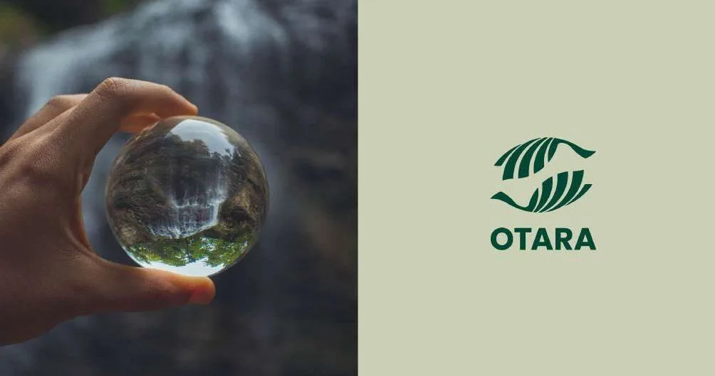
We extended green and spherical elements into the VI and brand graphics; the T–P “O” shape also works as a pattern printed on packaging paper.
B2B buyers rarely buy on the first visit. If the site does not make it easy to ask a question or request a quote, a qualified visitor leaves.
We ran Google Ads conversion campaigns and improved the website inquiry path.
Three brand directions: efficient supplier, modern eco-brand, human-centered company.
Green and spherical elements extended into the VI and brand graphics; the T–P “O” shape also works as a pattern printed on packaging paper.
Google Ads conversion campaigns and a better website inquiry path.
With 17 years of premium carton manufacturing experience, the company needed one brand expression for overseas buyers and better inquiry conversion.
We upgraded the brand from KVLI to taraPack, built a visual identity and then ran Google Ads conversion campaigns with a better website inquiry path.
Results are shared only with the brand's approval.
With 17 years of premium carton manufacturing experience, taraPack needed one brand expression that overseas buyers could recognize and trust.
Combine targeted advertising with a website that makes it easy for a qualified buyer to ask a question or request a quote.
Three directions: an efficient supplier, a modern eco-brand and a human-centered company.
Treat the identity as something that can appear on the product itself, not only on a website or a business card.
It lets a buyer move from reading about capability to asking a specific question with as little friction as possible.
Prepare a clear offer, pages that match the ad, and a way to track which inquiries come from which campaign.
With 17 years of premium carton manufacturing experience, the company needed one brand expression for overseas buyers and better inquiry conversion.
The brand was upgraded from KVLI to taraPack with three directions considered: efficient supplier, modern eco-brand and human-centered company. A visual identity extended green and spherical elements, including a T–P shaped O pattern printable on packaging paper.
Through Google Ads conversion campaigns and an improved website inquiry path. Deliverables were brand VI, packaging patterns and brand expression, plus Google Ads conversion and the inquiry path.
Ready when you are
Shopify design and operation, traffic, customer operations and SEO · GEO — one team across Los Angeles, Shenzhen and Hangzhou.
Free custom ad plan
Tell us where to send it. You’ll also get the Next2Market Growth Notes — practical DTC, affiliate and SEO · GEO ideas for brands going global.
No spam · One-click unsubscribe
Last updated